Radio Luz.
Orange frequency
On-air chaos, organized visually
Visual Identity, Typography, Key visual
Challenge
Developing a complete visual rebranding for Radio LUZ, the student radio station of the Wrocław University of Science and Technology. The objective was to capture the live, vibrant atmosphere of the station and engineer a distinctive identity that cuts through the noise of both traditional student broadcasters and the commercial FM radio market.
Strategy
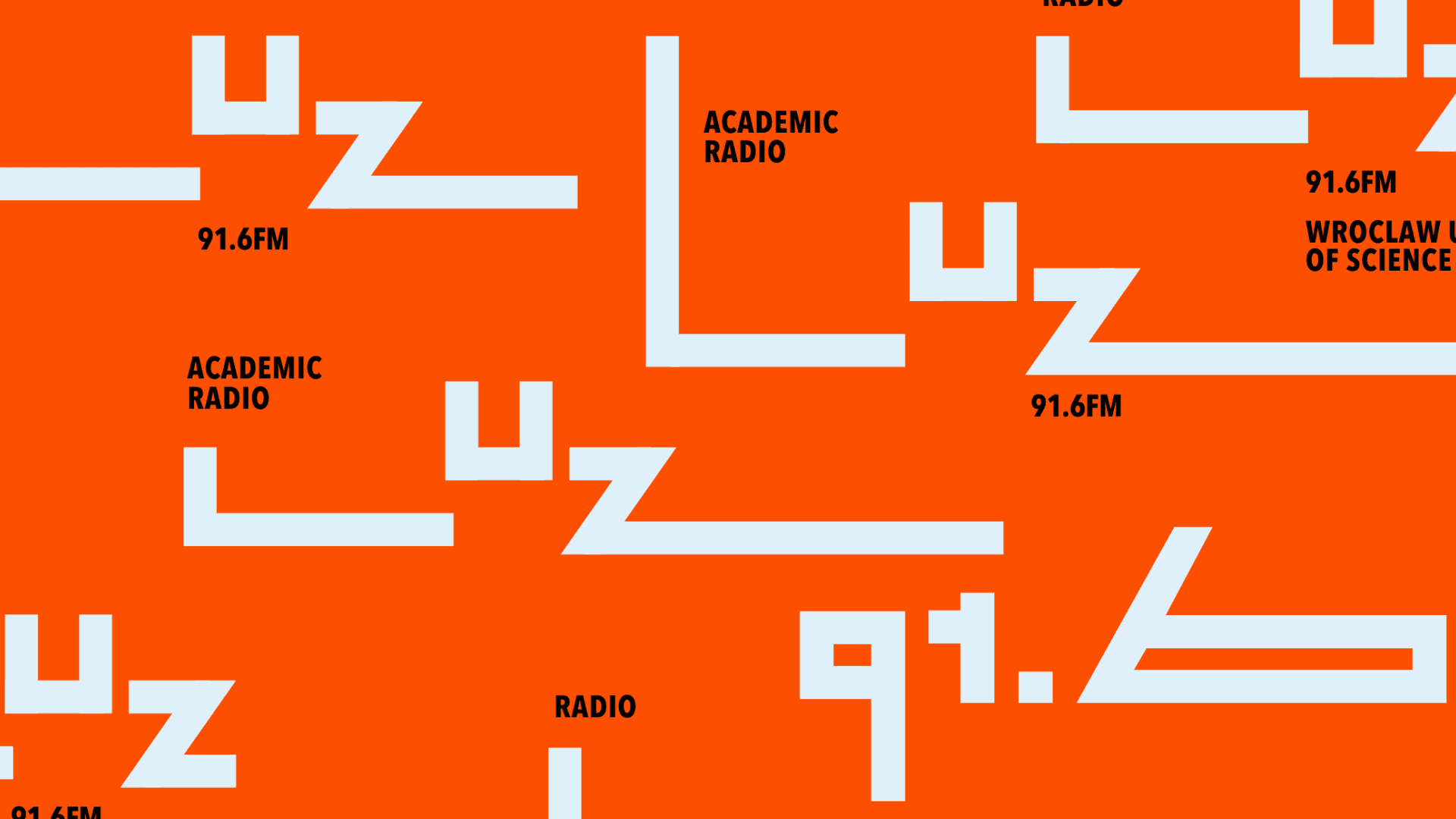
The concept goes for total simplicity, turning the rhythm of sound into clean layouts. Instead of messy graphics, it sticks to one high-energy color and typography built to move. This minimalist style gives the station a fresh, distinct look that feels independent and modern.
Identity
The visual language, co-created by Marian Misiak, uses a high-contrast palette of vivid orange, black, and white. The typographic logo features an elongated letter "L" that splits and stacks into dynamic "levels," mimicking a digital spectrum analyzer. Paired with heavy secondary typography, the entire grid system is built specifically with motion and animation in mind.
Outcome
A flexible, multi-platform toolkit optimized for digital, video overlays, merchandise, and event roll-ups. By stripping away visual clutter, the brand achieves instant recognition across both physical and online spaces.It’s clean, loud, and uncompromising—exactly how independent radio should look.
Credits
Typography: Marian Misiak