Berg.
Branding in the corporate consultancy field
Brand clarity for decision-driven consulting.
Strategy, Brand, Comms, Packaging

Challenge
Consulting firms often hide practical solutions behind dense corporate jargon and overly complex methodologies. The task involved creating a brand strategy and visual identity for BERG that reflects their straightforward, action-oriented consulting model. The objective was to build a clean, minimalist framework that translates global expertise and hands-on teaching experience into an accessible, clear, and professional market presence.
Strategy
The strategy focuses on stripping away traditional consulting filler to highlight practical utility. By positioning Berg Partners around the core belief that ideas must turn into real plans, the communication framework is designed to be direct and accessible. This clear message gives corporate leaders immediate clarity and confidence in their decision-making.
Identity
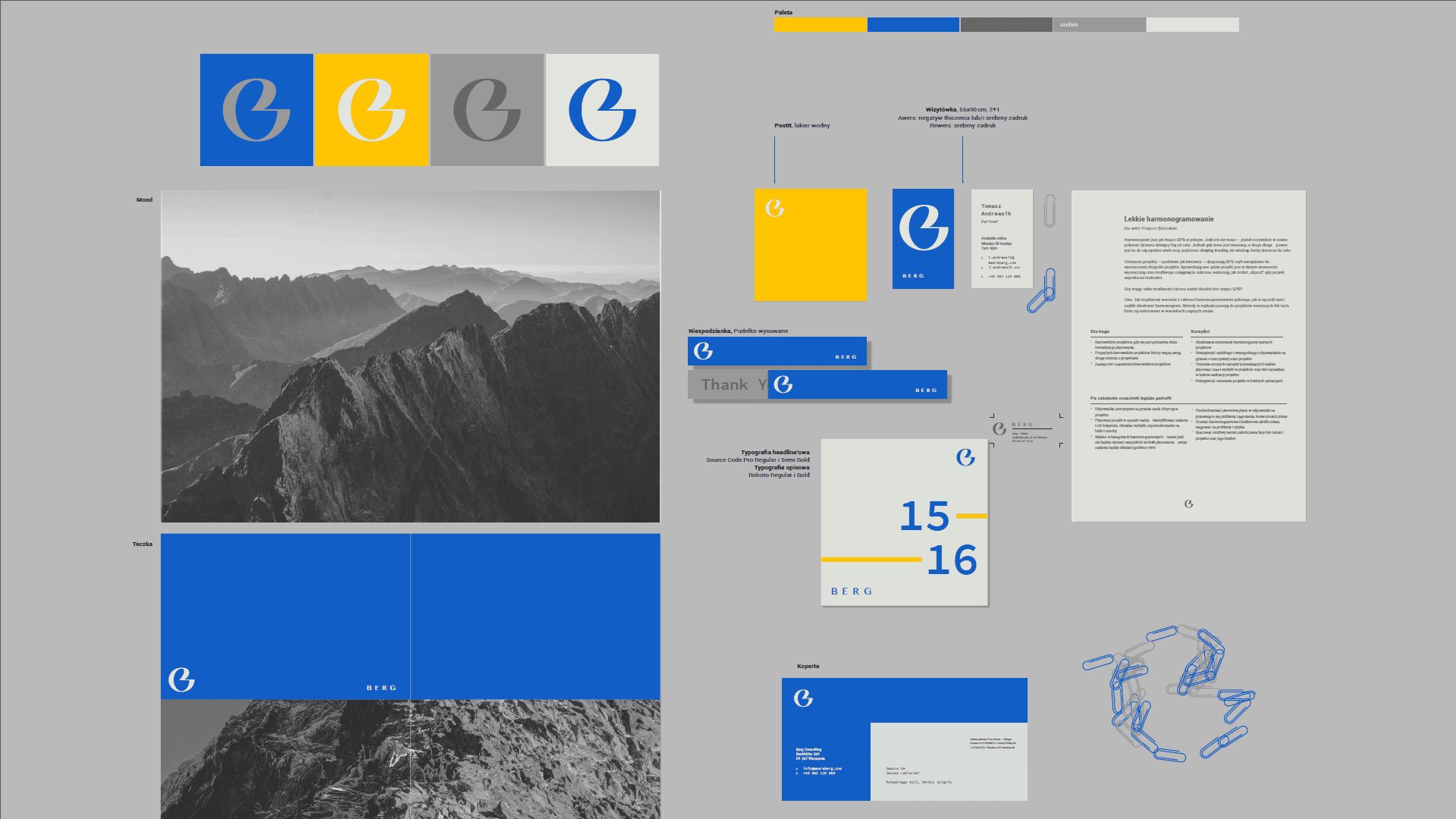
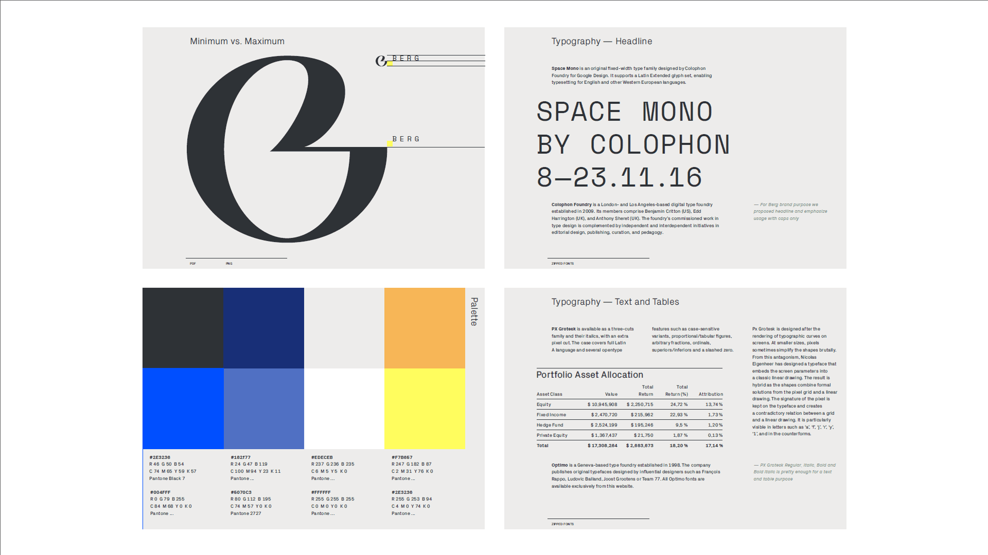
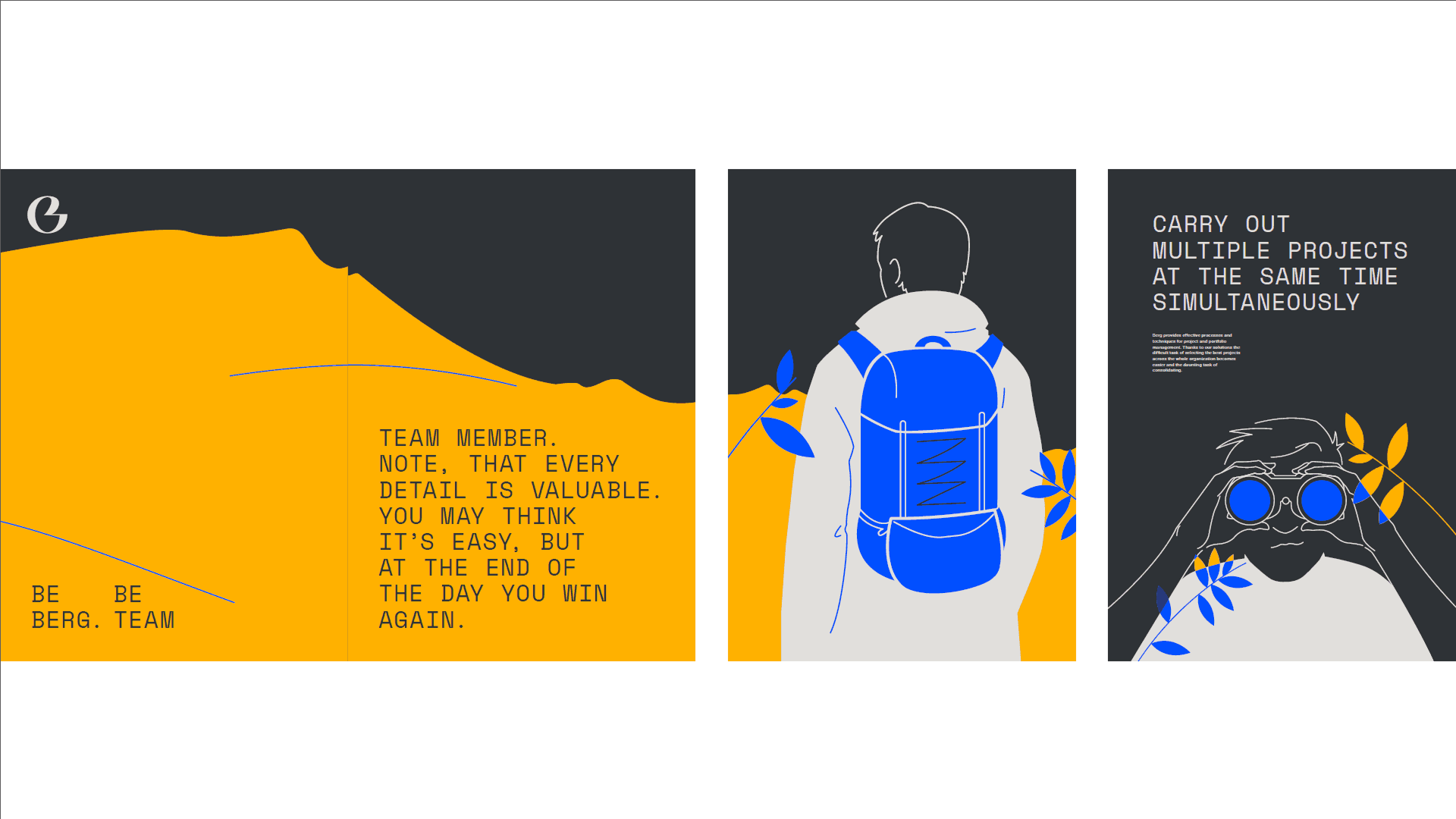
The identity is built around a smooth, minimalist monogram of the letter "B." This simple geometry is paired with a clean font and a recurring mountain motif used as a functional supporting element. The palette uses a professional yet fresh combination of blue, yellow, grey, and white.
Outcome
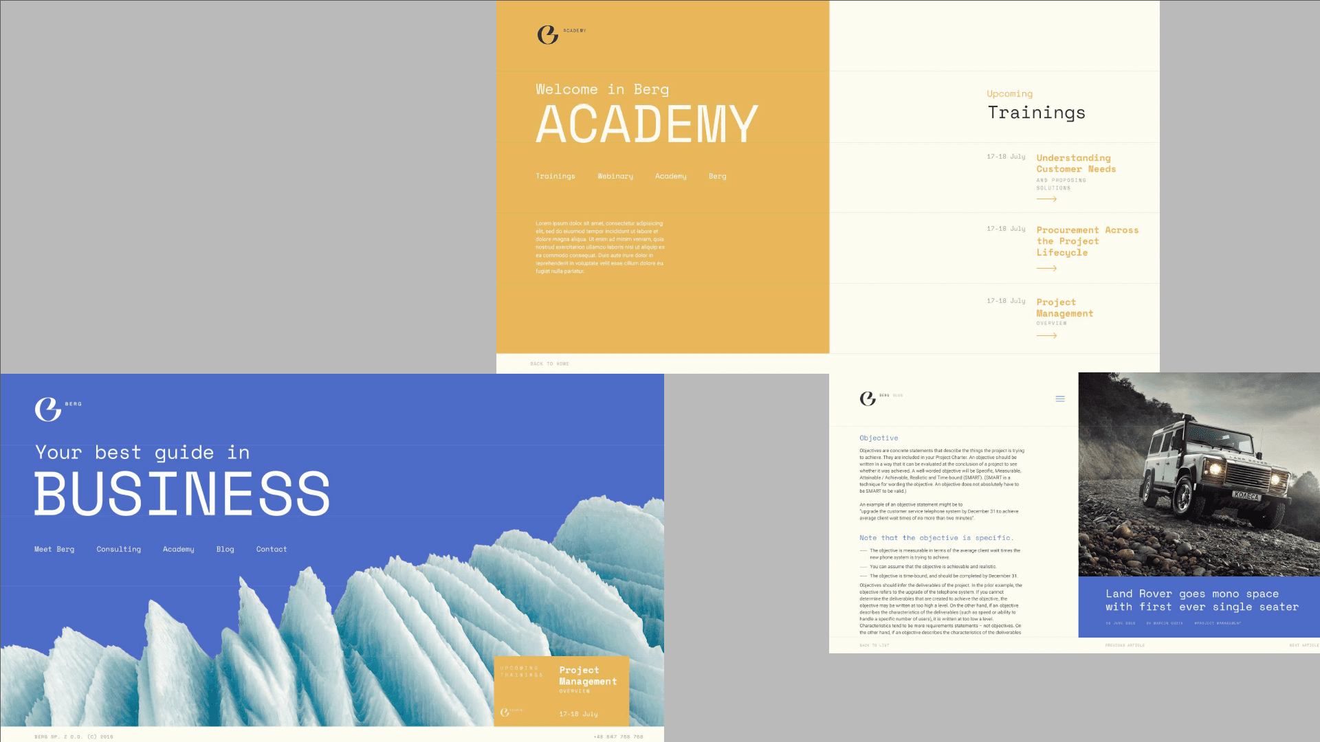
The project delivered a complete operational toolkit including a modular brand system, communication guidelines, and physical packaging layouts. Berg Partners received ready-to-use digital templates that speed up their content creation. This streamlined framework gives the firm a fresh, distinct competitive edge, allowing them to pitch their consulting and training services with absolute clarity.
Credits