Natural Nation.
The Organic Form
Shelf-ready packaging with a clear product story.
Strategy, Brand, Packaging
Challenge
Creating a standout packaging system for Natural Nation, a brand producing 100% natural and organic supplements. Operating in a wellness market, the brand needed a visual system that instantly signals purity, clarity, and top-tier quality.
Strategy
The strategy addresses the crowded marketplace by stripping away the unnecessary noise. By pairing fluid, nature-inspired elements with a functional layout, the packaging positions Natural Nation as a clean, honest, and premium option for conscious consumers.
Identity
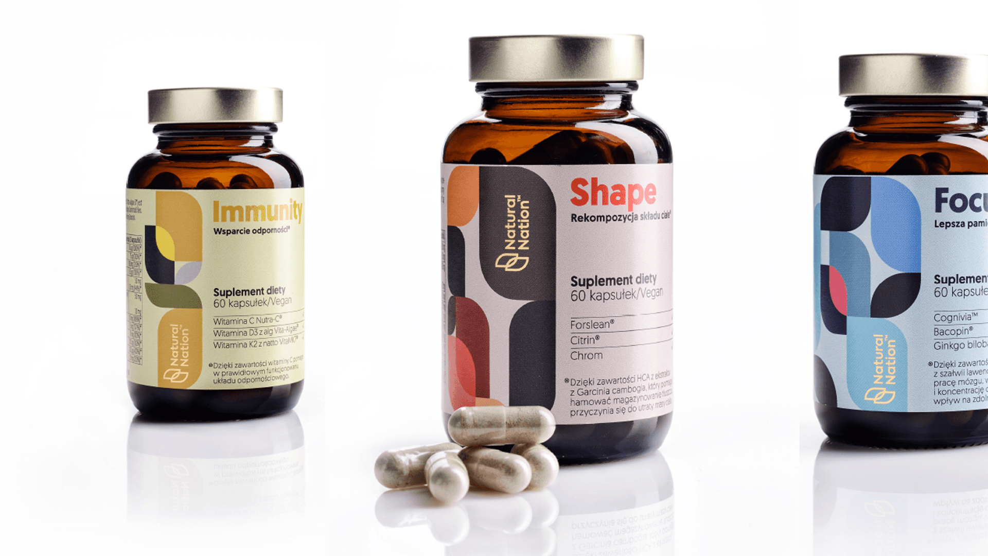
The packaging system is built around a series of fluid, organic shapes. These abstract natural forms change their color palette depending on the specific type and function of the supplement, creating an intuitive, color-coded product line. The layout features simple typography that cuts straight through the fluff, improving readability on the shelf.
Outcome
The packaging gives Natural Nation a powerful visual edge in both digital and physical retail spaces. By trading chaotic ingredient lists and typical wellness clichés for bold type and a clean, organic color system, the bottles act as an open book.
Credits