Herosi.
Empowering Brave Hearts
Visual Identity, Key visual, Social media


Challenge
Developing a comprehensive brand identity for Herosi, a Polish foundation that has been funding innovative oncology treatments, advanced medical equipment, and clinical care for children. The objective was to craft a recognizable visual language that balances institutional trust for prospective donors with a sense of joy and optimism for the young patients on the wards.
Strategy
The strategic direction centers on the uplifting concept of a superhero, leaning directly into the foundation's name. The identity introduces an empowering narrative, while the design strategy bridges professional, high-impact advocacy with a warm, child-friendly world.
Identity
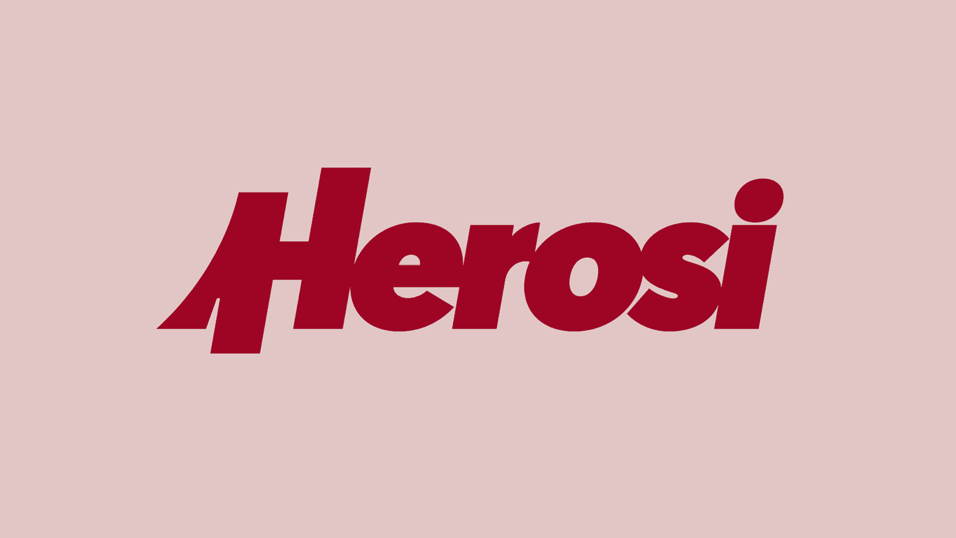
The visual system anchors itself on a bold, high-contrast typographic wordmark with an energetic italic slant. The capital letter "H" features an integrated, flowing cape motif that doubles as an independent graphic emblem. The color strategy uses an intentional pairing of deep crimson and powder pink.
Outcome
The foundation received a versatile and instantly recognizable branding kit tailored for all physical and digital media. The scalable toolkit equips Herosi with the necessary assets.
Credits