Back App.
Shift the perspective. Fix the back.
Strategy, Brand, Comms, Packaging, Web Design


Challenge
Bridging the gap between raw data and an intuitive fitness experience was the core mission for Back App. The task was to build a brand for a training device that feels like a piece of high-tech equipment rather than a clinical tool. This required a visual language that communicates precision and "profound perspective", helping users understand their bodies through a digital lens. The goal was to make data-driven training feel less like a chore and more like a premium lifestyle upgrade.
Strategy
The strategy focuses on the "art of viewing"—the idea that how an object is perceived fundamentally changes how it is used. By positioning Back App as a sophisticated blend of hardware and software, the brand speaks to a modern audience that values both high-end tech and physical health. The communication is stripped back and focused, letting the device’s functionality lead the narrative.
Identity
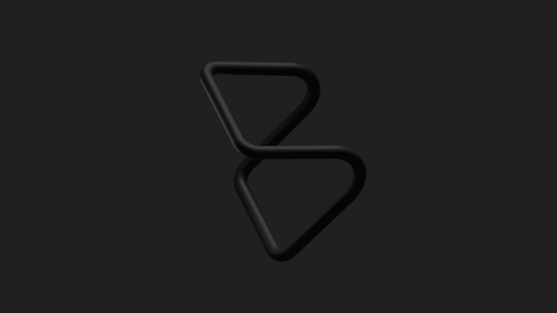
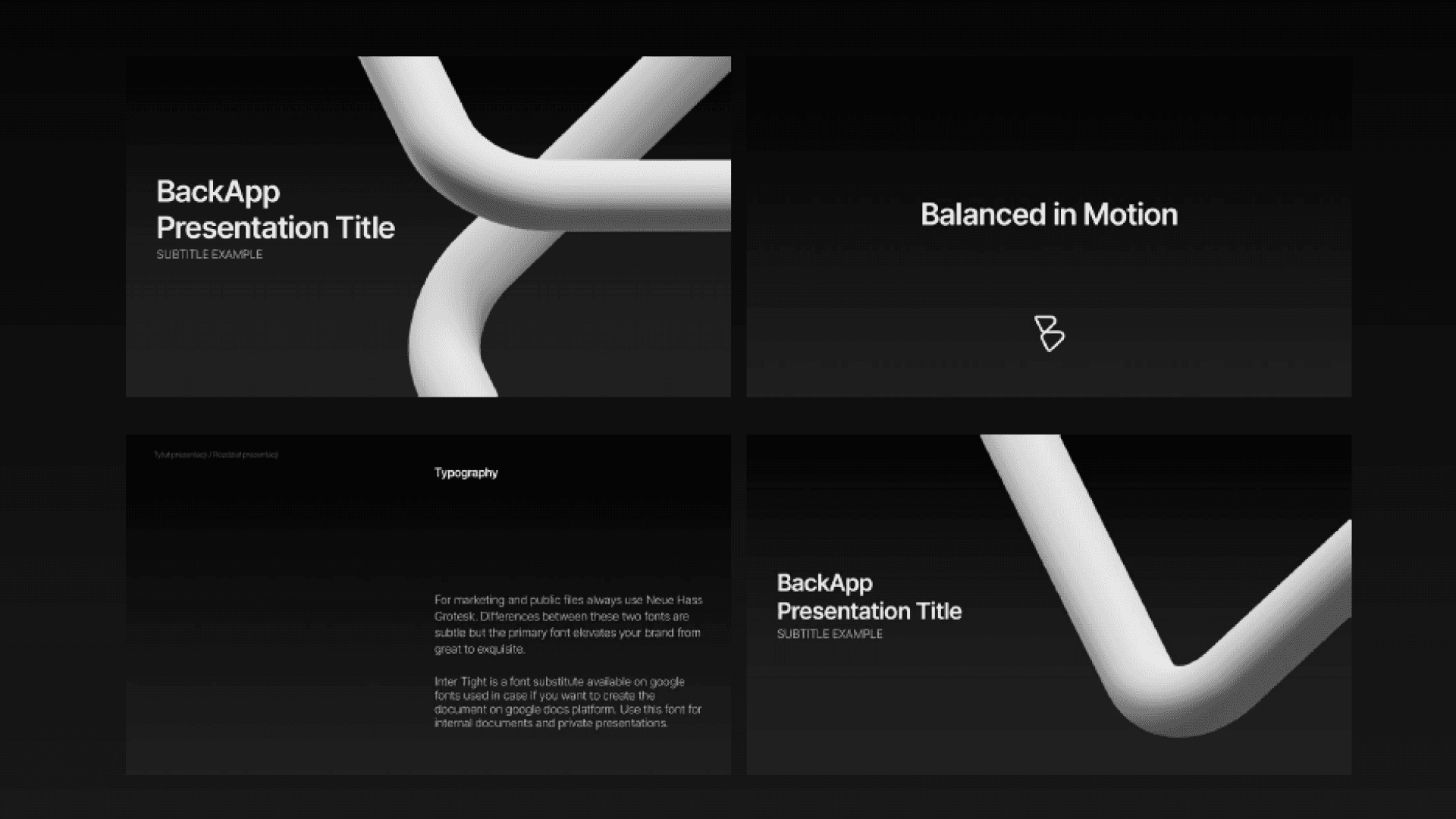
The identity is built around a monogram that directly mimics the physical shape of the device. This "B" icon lives in two worlds: a sleek 3D render and a clean, flat version for digital clarity. A sans-serif typeface and a high-contrast palette of black, white, and grey provide a professional foundation. "Functional accents"—brick red, soft green, and calm blue—were introduced to guide the user through the UI with rhythmic ease.
Outcome
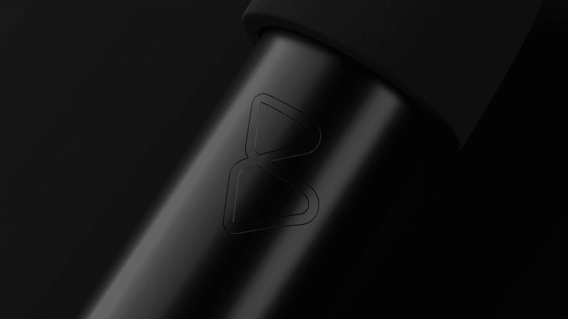
The result is a brand ecosystem that feels as balanced as the spine it helps to train. By merging 3D depth with flat minimalism, the identity perfectly reflects the relationship between the physical device and the digital application. The clean UI and premium packaging deliver a consistent, "eye-catching" experience that stands out in the fitness tech market.
Credits